The colour is only the first thing you see
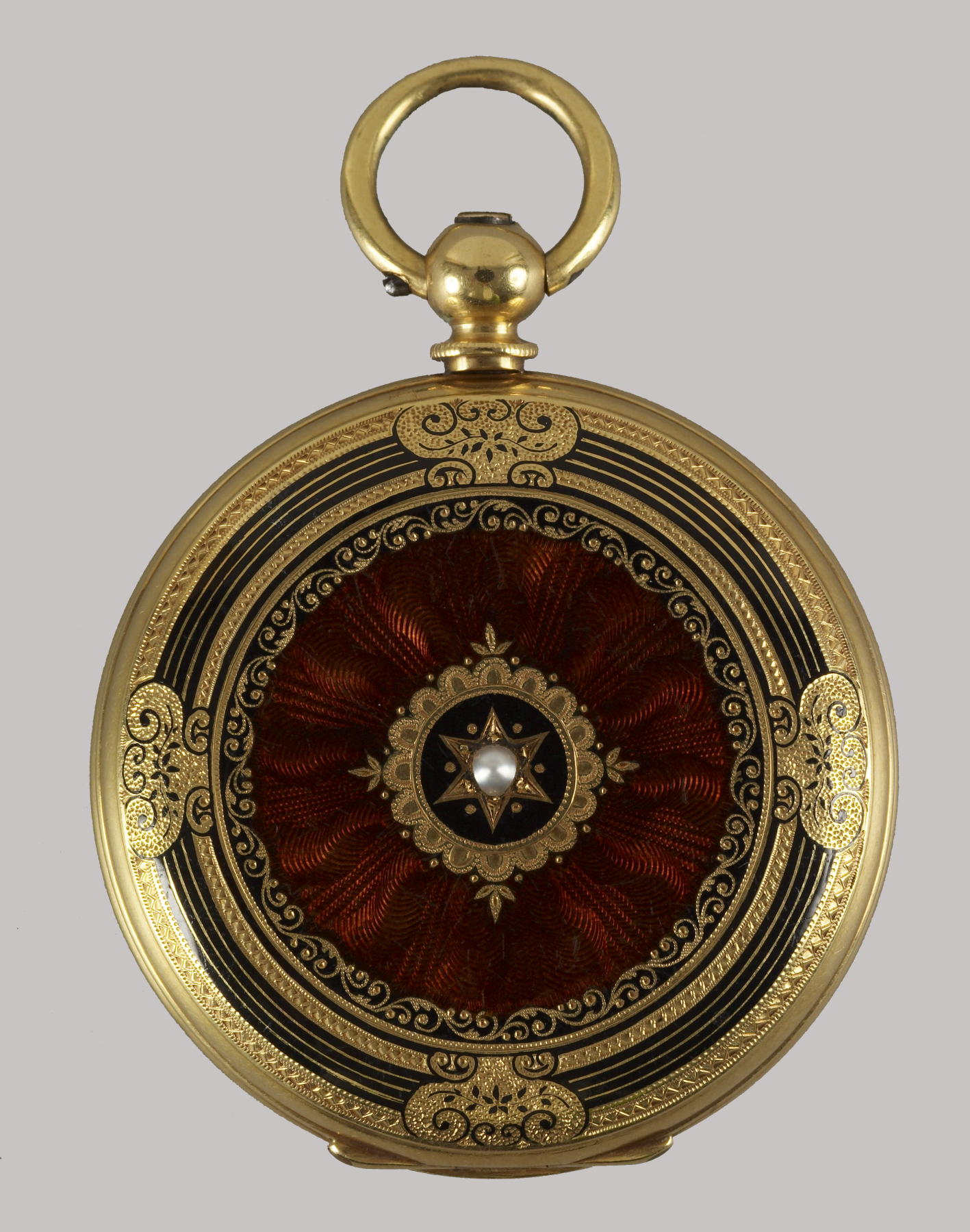
At first glance, the back of this small watch reads as a warm, glossy circle. Look again and the colour seems to contain a second surface: fine lines radiate beneath it, carrying the eye towards a pale central point. This is the quiet pleasure of guilloché enamel. The ornament rewards changing attention rather than adding another stone.
Our reader question is specific: how can you recognise what a guilloché-enamel description is trying to tell you? Start with this documented example, then use a short looking card when visiting a collection or discussing a piece. Nothing in the exercise authenticates an object or assigns a price. It simply makes the visible surface and the unanswered questions easier to describe.
Two operations, one optical effect
The V&A explains guilloché enamelling as mechanical engraving combined with translucent enamel. A patterned metal ground is covered with glass-based colour, fused by heat. The engraving remains visible through that layer. The technique therefore asks us to look at both the line and the coloured covering, rather than treating every glossy coloured surface as the same process.
Imagine two drawing sheets laid together, one carrying fine lines and the other a transparent wash of colour. That is an analogy for looking, not a recipe for manufacture. In the actual object, the substrate, engraved pattern and enamel belong to a constructed surface. A photograph can suggest their interaction, but cannot let you feel the surface, establish how it was made, or inspect what lies beneath an opaque area.
A watch back with a precise identity
The Walters Art Museum records this Ladies Hunting Case Watch as Swiss, dated 1840–49, with a movement by Mathey Peytieu. Its description identifies engraved gold beneath brown translucent enamel on the reverse, set with a half-pearl. Accession 58.287 and the credit “Gift of Liz and Peter Moser, 2006” tie those statements to this particular object.
Keep that precision when taking notes. The movement attribution does not automatically name the maker of every part of the case or its decoration. Nor should this nineteenth-century example be called Fabergé simply because guilloché enamel is often associated with that name. A technique can travel across objects and workshops; attribution needs evidence for the individual piece.
Read the pattern before reaching for a verdict
Begin at the centre and trace a few lines towards the edge with your eyes. Do they radiate, repeat in waves, overlap, or change direction? Then observe where the border interrupts the field. On this watch back, the central pale setting and surrounding circular outline help organise the pattern. That is our visual reading of the photograph, separate from the museum’s material identification.
Next consider the light. Bright reflections can obscure fine lines, while dark areas may make them appear to disappear. Ask for an overall view and one closer view in different light before interpreting a missing line as damage. When inspecting a jewel in person, ask permission before handling it and follow the owner’s guidance; opening a watch case or operating an unfamiliar catch is not part of casual looking.
The distinction that keeps descriptions honest
Engine-turned decoration can also be left visible without enamel, as the V&A’s metalworking guide explains. So “guilloché” and “guilloché enamel” should not be used as interchangeable labels for every patterned metal surface. If a seller uses the longer term, ask what material forms the coloured layer and what supports that identification. A repeating pattern alone does not answer that question.
There is no need to demand an immediate verdict from a screen. Record “repeated lines visible beneath a glossy brown surface” as an observation, and “translucent enamel over engraved gold” as an attributed description until evidence supports it. If the distinction is material to a consequential purchase, obtain advice from a suitably qualified specialist who can examine the actual object. The looking card is preparation for that conversation.
An original looking card for a quiet surface
Use five headings: overall colour; pattern direction; visible interruptions; documented materials and maker statements; remaining questions. Here is a hypothetical entry for an unspecified listing: “blue field; repeating curved lines; glare hides lower edge; seller states enamel on silver; reverse and repair history not supplied.” This is an invented working example, not a report about a real jewel.
Finish with one answerable request: “Please provide a sharp reverse view and identify any known repairs to the coloured surface.” A useful description does not make an unexplained patch automatically original or automatically a fault. It gives the owner or seller a chance to explain it. Keep that response with the item record, and seek conservation advice before cleaning or intervening in historic enamel.
Let precision deepen the pleasure
The watch back does not need a spectacular story to hold attention. Its small scale, repeated lines and restrained central accent are enough for an attentive encounter. That aesthetic response is editorial judgment; it is not a condition grade or a valuation. You can enjoy the surface while remaining exact about what you know.
The most useful habit is to move from colour, to pattern, to evidence. Each stage adds something the previous one cannot supply. By the time you close your notebook, “beautiful brown watch” has become a more precise encounter with a particular object—and a clearer set of questions for the next coloured jewel that catches your eye.
Continue in the archive
Sources and image rights
Institutional sources and image rights checked on 16 November 2026.